3 Main Types of Price Charts in Trading (And How to Read Them Like a Pro)
Learn how to read line, bar, and candlestick charts. Master chart reading for day trading, forex, stocks, and crypto with this beginner-friendly guide.

If you want to become a consistently profitable trader, there's one skill you simply can't skip: learning how to read a price chart. No matter if you're trading stocks, forex, crypto, commodities, or anything else, your chart is your window into the market. It's the visual story of buyers and sellers battling it out, second by second, day after day.
But here's the thing — not all price charts look the same. In fact, traders use different chart types depending on their style, strategy, and how they like to see information. If you've ever wondered why some charts look like simple lines while others are full of colorful "candles" or tall vertical bars, you're in the right place.
In this guide, we'll explore the three most common types of price charts:
- The Line Chart — clean, simple, and beginner-friendly.
- The Bar Chart — detailed and precise.
- The Candlestick Chart — visually rich and packed with trading insights.
By the time you finish reading, you'll know how each chart works, what they're best for, and—most importantly—how to read them like a pro so you can make better trading decisions.
Why Price Charts Matter in Trading
If you're serious about trading, think of your price chart as your GPS. You wouldn't drive to a new destination without knowing the route, right? Likewise, you shouldn't enter a trade without understanding where the market has been and where it might be headed. Trading without charts is like trying to drive in a city without a GPS, road signs, or even a map. You might eventually get somewhere, but it will be mostly luck, and probably expensive in both time and money.
Price charts show you:
- Market sentiment — Are traders feeling bullish (confident) or bearish (fearful)?
- Trend direction — Is the market trending upward, downward, or sideways?
- Volatility — Is the market moving sharply or barely moving at all?
- Key levels — Support and resistance points where prices tend to bounce or reverse.
Without charts, you'd be trading blind, relying on guesswork instead of analysis. Charts give you the context you need to spot opportunities and avoid costly mistakes.
And here's something important: charts work across all markets. Whether you're analyzing Bitcoin on a 5-minute chart or gold prices over the last 10 years, the principles of chart reading remain the same.
Overview of the 3 Main Types of Price Charts
Before we go deeper, here's a quick snapshot of what we're working with:
- Line Chart — Plots only closing prices over a period. Clean and easy to read but lacks detail.
- Bar Chart — Shows open, high, low, and close (OHLC) for each period. Gives more information but looks less visual.
- Candlestick Chart — Similar to a bar chart but with color-coded "candles" that make price movement easier to interpret.
Each chart type tells the same story (price movement) but in a different way—like three different styles of handwriting telling you the same sentence. Which one you choose depends on how you prefer to read that story.
Type 1: Line Charts
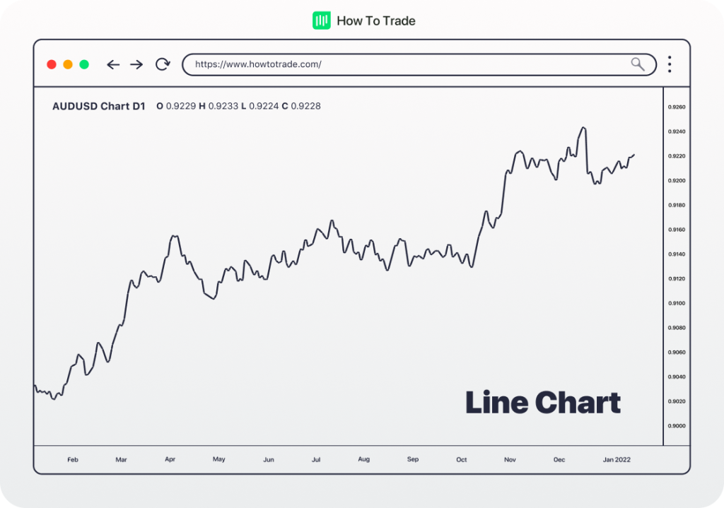
If you're brand new to trading, the line chart is the perfect place to start. It's exactly what it sounds like—a line connecting closing prices over a period of time.
Imagine plotting today's closing price for a stock, then doing the same tomorrow, and the next day, and connecting the dots with a line. That's a line chart.
Type 2: Bar Charts
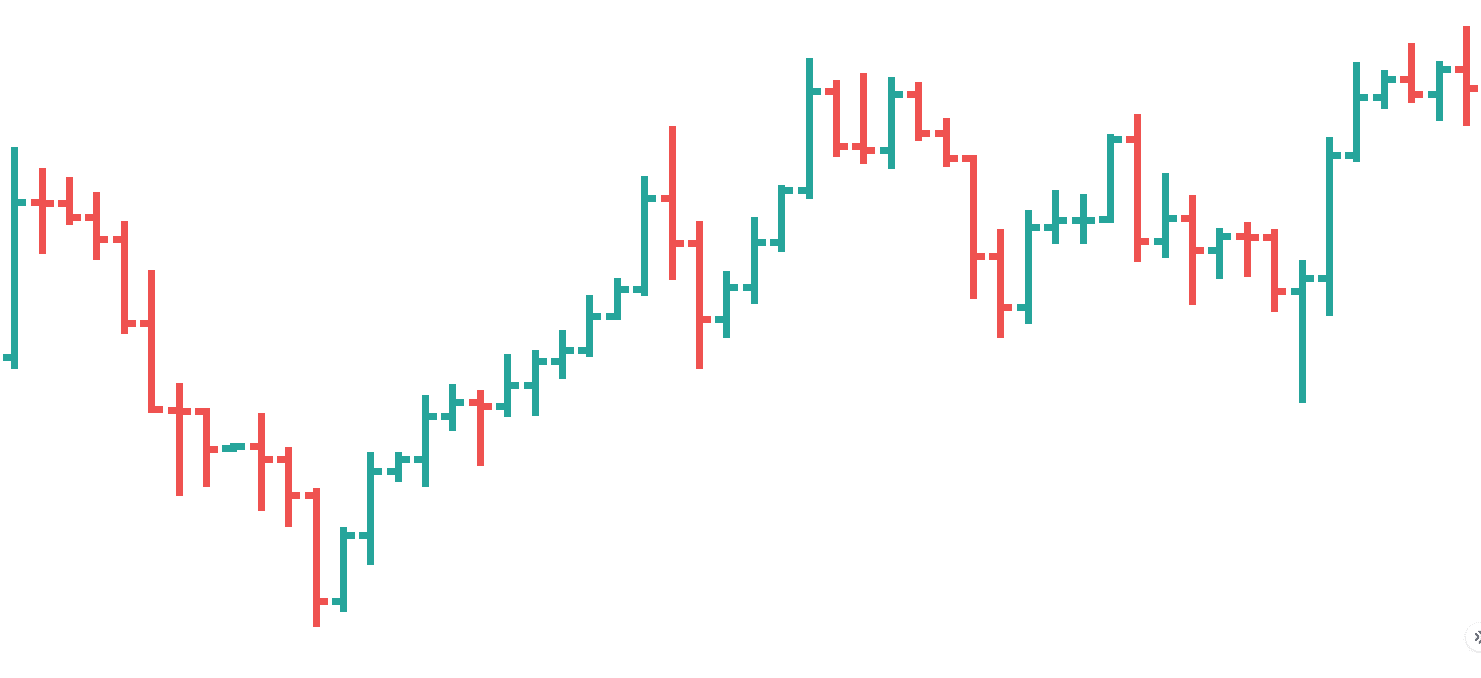
As you progress in trading, you'll probably want more detail than a line chart offers. That's where the bar chart comes in.
A bar chart is made up of vertical bars, each representing a specific time period (minute, hour, day, etc.). Each bar shows four key prices: Open, High, Low, and Close.
Type 3: Candlestick Charts
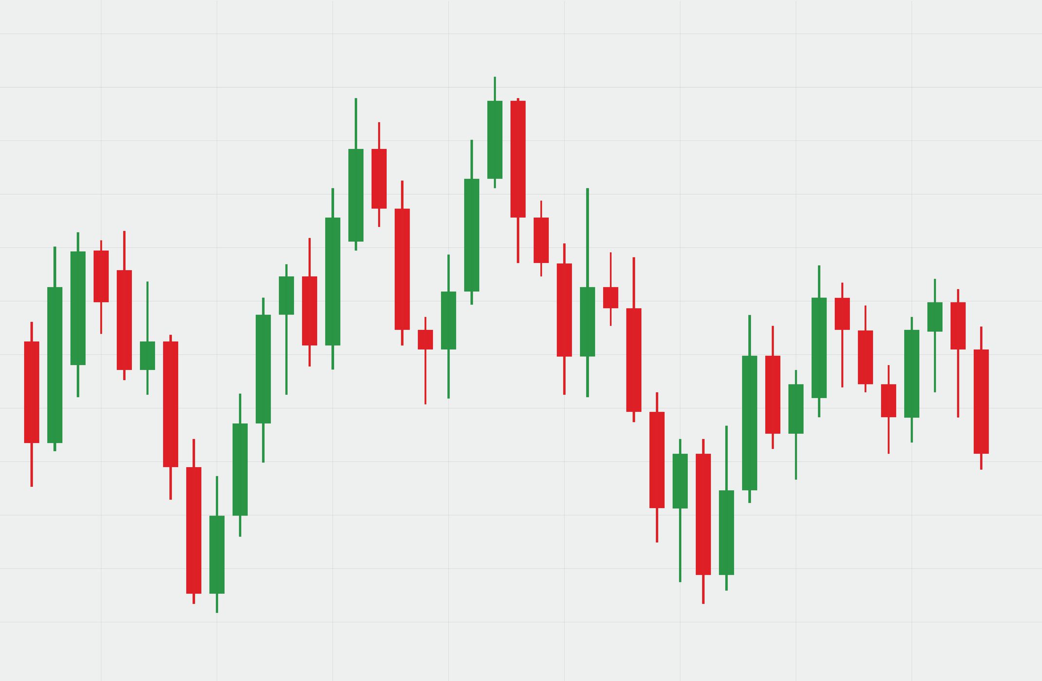
Candlestick charts are by far the most popular among traders today—especially day traders. They pack the same four key prices as bar charts but in a visually rich format that's easier to interpret at a glance.
How to Read a Line Chart
Reading a line chart is almost effortless. You simply follow the line from left to right and see whether it's trending upward, downward, or sideways. If the line is climbing, prices are generally rising; if it's falling, prices are generally dropping.
Most line charts use closing prices because they're considered the most important data point for the day. They represent the final consensus between buyers and sellers before the market closes.
Advantages of Line Charts
- Simplicity — There's no clutter, so you can quickly see the overall trend.
- Great for beginners — Easy to interpret without getting overwhelmed.
- Good for long-term views — Perfect for looking at months or years of data.
Limitations of Line Charts
The downside is that line charts don't show much detail. You won't see intraday price swings, highs, lows, or how volatile the market was during the day. If you're day trading, this lack of detail can hide critical information.
Best use: Long-term trend analysis or when you want a clean, simple view of price movement without distractions.
How to Read a Bar Chart
A bar chart is made up of vertical bars, each representing a specific time period (minute, hour, day, etc.). Each bar shows four key prices:
- The Open price (marked with a short horizontal line on the left).
- The Close price (marked with a short horizontal line on the right).
- The High price for the period (top of the bar).
- The Low price for the period (bottom of the bar).
Look at a single bar:
- If the close is higher than the open, the bar is usually colored green or black (bullish).
- If the close is lower than the open, it's colored red (bearish).
- The length of the bar shows volatility—long bars mean big price moves, short bars mean small moves.
Bar Chart Advantages
- More detailed than line charts—shows highs, lows, and volatility.
- Works well for short-term and long-term analysis.
- Helps identify patterns and key price levels.
Limitations: Some traders find them harder to read than candlestick charts because the visual cues are more subtle. Also, they can get cluttered if you're looking at very short time frames.
Best use: For traders who want detailed price information without the extra visual elements of candlesticks.
How to Read a Candlestick Chart
Each "candle" has:
- A body — the thick part, showing the open and close.
- Wicks or shadows — thin lines above and below the body showing the high and low.
- Colors — typically green for bullish candles (close > open) and red for bearish candles (close < open).
If a candle is green and the body is long, buyers were in control for that period. If it's red and long, sellers dominated. Small bodies indicate indecision, while long wicks suggest rejection of certain price levels.
Candlestick charts are powerful because they reveal market psychology. For example, a candle with a long upper wick might indicate that buyers tried to push the price higher but sellers pushed it back down—a potential sign of weakness.
Candlestick Chart Advantages
- Highly visual and intuitive once you learn them.
- Great for spotting patterns like doji, engulfing, hammer, shooting star, etc.
- Work well for all time frames, especially short-term trading.
Limitations: They can feel overwhelming at first because there's so much information packed into each candle. Also, without understanding the context, it's easy to misinterpret patterns.
Best use: Short-term/day trading and identifying market sentiment quickly.
Advanced: How to Read Common Candlestick Patterns
Learning candlestick patterns is like learning a visual trading language. Here are some of the most common:
Single Candle Patterns
- Doji — Open and close are nearly the same. Indicates indecision.
- Hammer — Small body, long lower wick. Often bullish if found after a downtrend.
- Shooting Star — Small body, long upper wick. Often bearish after an uptrend.
Double Candle Patterns
- Bullish Engulfing — A large bullish candle fully engulfs the previous bearish candle. Suggests buyers are taking over.
- Bearish Engulfing — The opposite; sellers taking over.
Triple Candle Patterns
- Morning Star — Bullish reversal pattern of three candles.
- Evening Star — Bearish reversal pattern of three candles.
RELATED READ: 50+ Day Trading Terms Every Trader Should Know (Beginner-Friendly Guide)
Chart Types Comparison
Chart Type
Data Shown
Strengths
Weaknesses
Line Chart
Closing prices only
Clean, simple view
Lacks detail
Bar Chart
OHLC (Open, High, Low, Close)
Detailed without color clutter
Less visual than candlesticks
Candlestick
OHLC with color-coded bodies
Highly visual, shows market psychology
Can overwhelm beginners
Choosing the Right Chart Type
So, which chart should you use? It depends on your style:
- Long-term investors often prefer line charts for clarity.
- Swing traders might use bar charts to see detailed price action over days or weeks.
- Day traders typically favor candlestick charts for quick decision-making.
Some traders even use multiple chart types together—for example, a line chart to see the big trend and candlesticks for precise entries.
Real-World Examples of When to Use Each Chart Type
- Line Chart Example: An investor checking Apple stock's 5-year performance might use a line chart to quickly see if the stock is trending upward.
- Bar Chart Example: A swing trader in crude oil futures might use a bar chart to spot exact highs and lows for better stop-loss placement.
- Candlestick Chart Example: A forex day trader looking for reversal patterns on the EUR/USD 15-minute chart will likely use candlesticks.
Tips for Reading Price Charts Like a Pro
Once you know the basics, the next step is sharpening your chart-reading skills:
- Understand trends — Markets tend to move in trends. Identify if you're in an uptrend, downtrend, or sideways range.
- Learn support and resistance — These are price levels where the market tends to pause or reverse.
- Spot chart patterns — Double tops, head and shoulders, triangles, and flags can give clues about future moves.
- Confirm with volume — High volume on a breakout adds strength to the move.
- Keep it simple — Don't overload your chart with too many indicators; focus on the essentials.
Pro Tips for Applying Chart Analysis in Day Trading
- Start with the higher time frame — See the big trend first before zooming in.
- Watch for confluence — When support, resistance, and a candlestick pattern line up, the signal is stronger.
- Combine with indicators — Moving averages, RSI, or MACD can confirm what the chart is showing.
- Backtest — Before trading live, test your chart-reading approach on historical data.
Common Mistakes to Avoid
Even experienced traders slip up when reading charts. Watch out for:
- Focusing only on one time frame.
- Ignoring the bigger trend.
- Over-relying on one chart type.
- Overcomplicating your charts with too many indicators
- Letting emotions overrule what the chart is showing.
Final Thoughts
Mastering price charts is a must for anyone serious about trading. Start with the basics, pick a chart type that fits your style, and practice reading it daily. Over time, you'll start to "see" the market in a way that helps you make better trades—and avoid bad ones.
And remember, no matter how good your chart reading gets, risk management is key. Use tools like the Day Trading Profit Calculator to make sure you're protecting your capital while chasing profits.
FAQ
What is the most accurate type of price chart for day trading?
▼
There's no single "most accurate" chart — accuracy depends on your strategy. For most day traders, candlestick charts offer the best balance of detail and visual clarity. They show price movement, momentum, and market sentiment in a way that's easy to interpret quickly. However, some traders prefer bar charts for cleaner OHLC data without the distraction of candle colors.
How can I tell if a price chart is showing a false signal?
▼
False signals happen when the chart suggests a price move, but the market quickly reverses. To reduce false signals: Confirm patterns with volume — strong moves usually have higher trading volume. Check higher time frames to make sure the move aligns with the overall trend. Wait for candle closes instead of reacting mid-formation.
Do different markets require different price chart types?
▼
Not necessarily. The principles of reading charts are the same across stocks, forex, crypto, and commodities. What changes is the time frame and detail you need. Crypto traders often prefer shorter time frames with candlesticks, while long-term stock investors may prefer line charts for a cleaner overview.
How far back should I look when analyzing a price chart?
▼
It depends on your trading style: Day traders often look back hours or days to find intraday patterns. Swing traders typically review weeks or months of data. Long-term investors may study years of historical price action to spot major cycles.
What's the difference between a price chart and a technical indicator?
▼
A price chart shows raw market data — price movement over time. A technical indicator is a calculation based on that data (like moving averages, RSI, or MACD) that helps you interpret trends, momentum, or overbought/oversold conditions. Indicators are tools layered onto charts; they don't replace reading the chart itself.
Price Charts Chart Reading Candlestick Charts Technical Analysis Day Trading Basics Trading Education
Frequently Asked Questions
What is the most accurate type of price chart for day trading?
There's no single "most accurate" chart — accuracy depends on your strategy. For most day traders, candlestick charts offer the best balance of detail and visual clarity. They show price movement, momentum, and market sentiment in a way that's easy to interpret quickly. However, some traders prefer bar charts for cleaner OHLC data without the distraction of candle colors.
How can I tell if a price chart is showing a false signal?
False signals happen when the chart suggests a price move, but the market quickly reverses. To reduce false signals: Confirm patterns with volume — strong moves usually have higher trading volume. Check higher time frames to make sure the move aligns with the overall trend. Wait for candle closes instead of reacting mid-formation.
Do different markets require different price chart types?
Not necessarily. The principles of reading charts are the same across stocks, forex, crypto, and commodities. What changes is the time frame and detail you need. Crypto traders often prefer shorter time frames with candlesticks, while long-term stock investors may prefer line charts for a cleaner overview.
How far back should I look when analyzing a price chart?
It depends on your trading style: Day traders often look back hours or days to find intraday patterns. Swing traders typically review weeks or months of data. Long-term investors may study years of historical price action to spot major cycles.
What's the difference between a price chart and a technical indicator?
A price chart shows raw market data — price movement over time. A technical indicator is a calculation based on that data (like moving averages, RSI, or MACD) that helps you interpret trends, momentum, or overbought/oversold conditions. Indicators are tools layered onto charts; they don't replace reading the chart itself.